Lead UX Design for Parliamentary Business System which is the primary internal system used by the Office of the Clerk.
#Figma #Wireframing #Prototyping #User Research #User testing
Parliament is the unicameral legislature of New Zealand and the Office of the Clerk is the legislature's secretariat. Every day, a plethora of bills, petitions and reports need to be recorded and processed by the Office of the Clerk to move the legislation process forward. The legacy system used to manage these data has been implemented for 10 years. At first glance, user interface gives flashback of those in the 1990s. Furthermore, all the business items are processed in a single application which makes it overcomplicated for users from different business units. The Office of the Clerk would like to have modern and robust applications that fit its current and changing requirements.
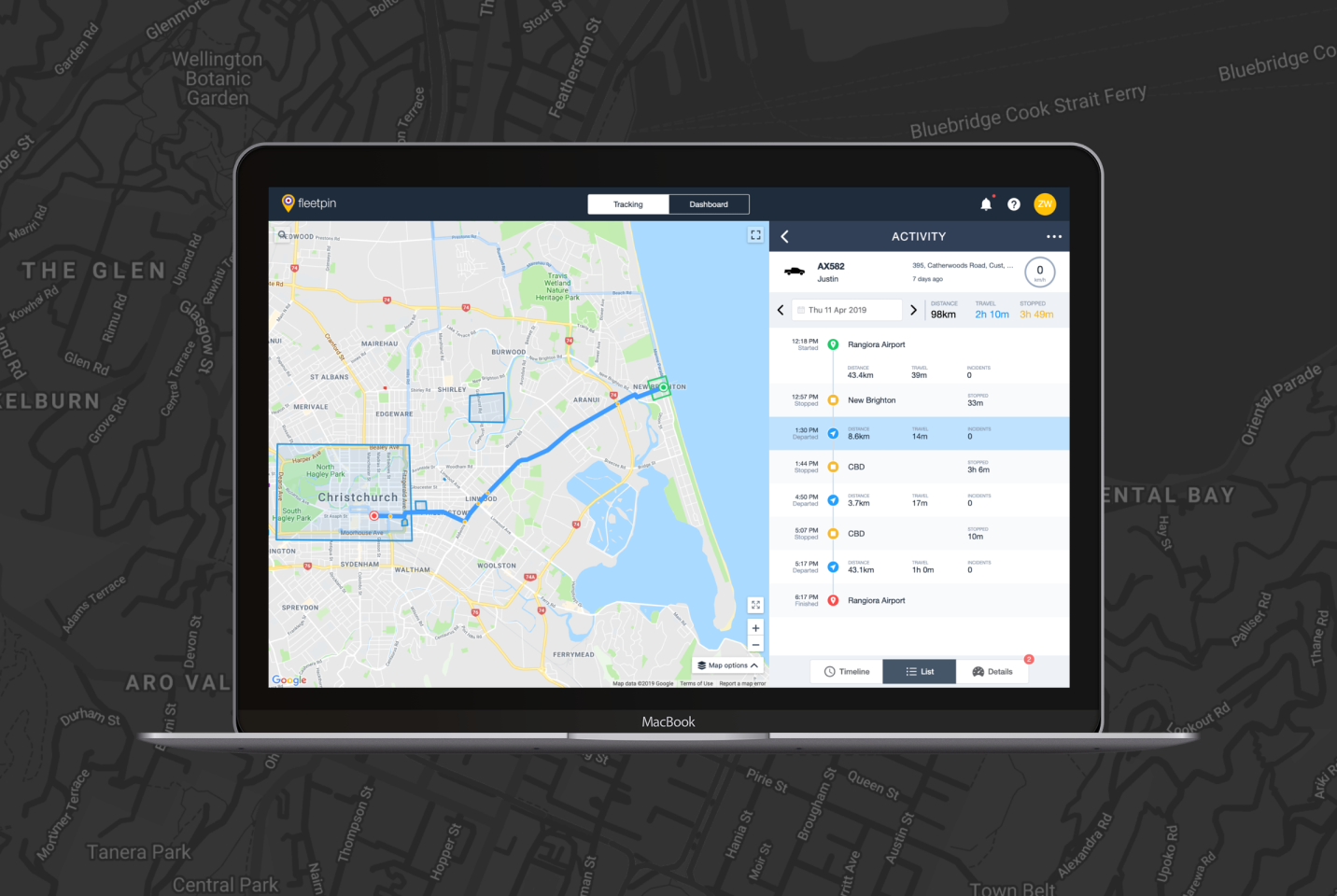
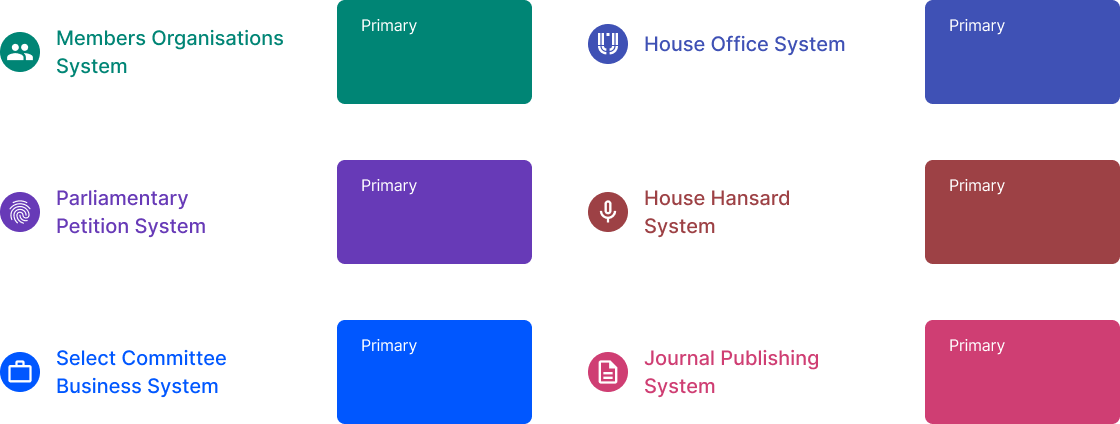
I led the design of Parliamentary Business System which includes 6 individual applications. I produced all major deliverables and presented these to stakeholders. I also worked as front-end developer to ensure the application details were true to design.
I collaborated with Business Analysts, Developers and Project Manager on requirement gathering and idea generation.
Through various stakeholder and user interviews, it was quite evident that the current system has too many features packed into a single application. Multiple applications need to be created to address unique requirements from different business units. Furthermore, users really crave for modern applications that will help to get the task done more efficiently. That's why, when we talk about Parliamentary Business System from the UX Design perspective, we talk about two high-level goals:
1. Create a design system to be used on multiple applications with
consistent look and feel.
2. Provide a beautiful and intuitive user experience to help users getting task
done more efficiently.
As the first and only UX Designer in the team, the challenge ahead was enormous. There was almost no design practice in the team, the only wireframes that developers could refer to were those drafted in Lucid Chart by business analyst. There were only 2-3 weeks before developers have to start working on the projects. And 3 different projects had to be started at the same time to meet the deadlines. While it was tempting to create a Parliamentary Design System from scratch, I quickly realised it was an impossible task.
Given the nature of being internal applications and having limited resources, it was quite evident that an existing Design System needs to be utilised to accelerate the design and development process. And since Blazor was chosen as the front-end framework for this project, the most compelling UI Component Library was Mud-Blazor which followed Material Design.
With the basic building blocks in place, the next task is to create shared layouts.Through multiple discovery sessions with Business Analysts and users from the Office of the Clerk, I consolidated the information and gathered the following findings:
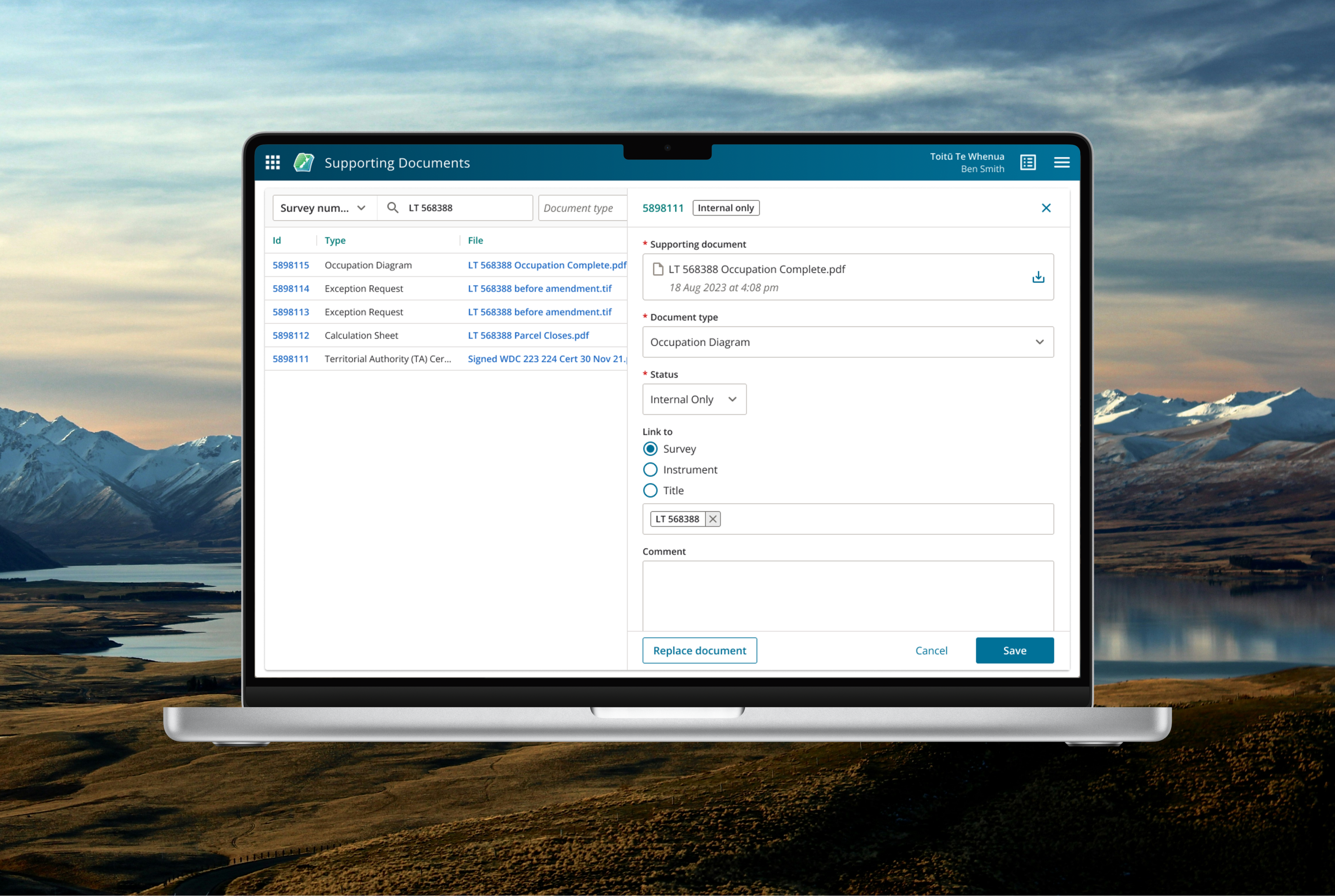
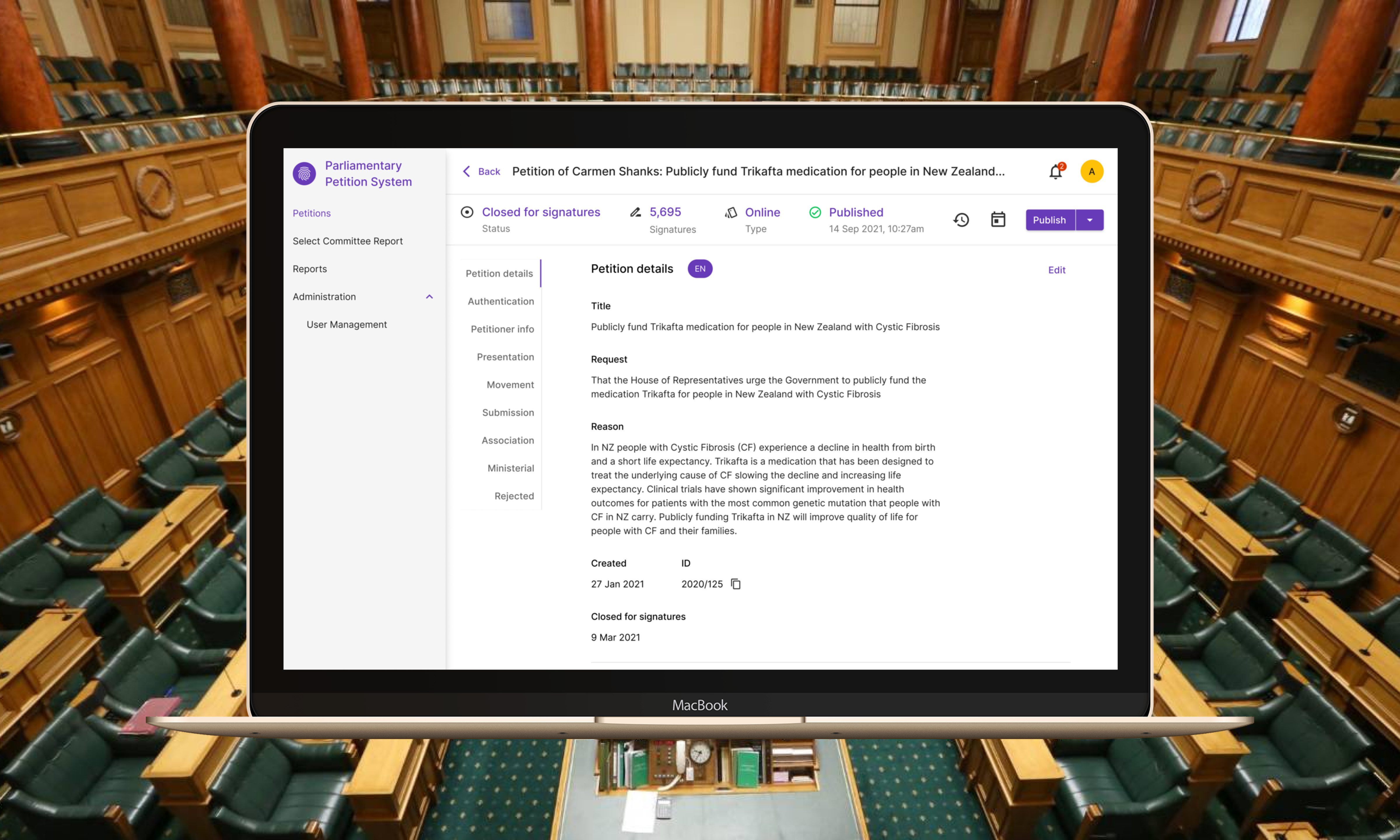
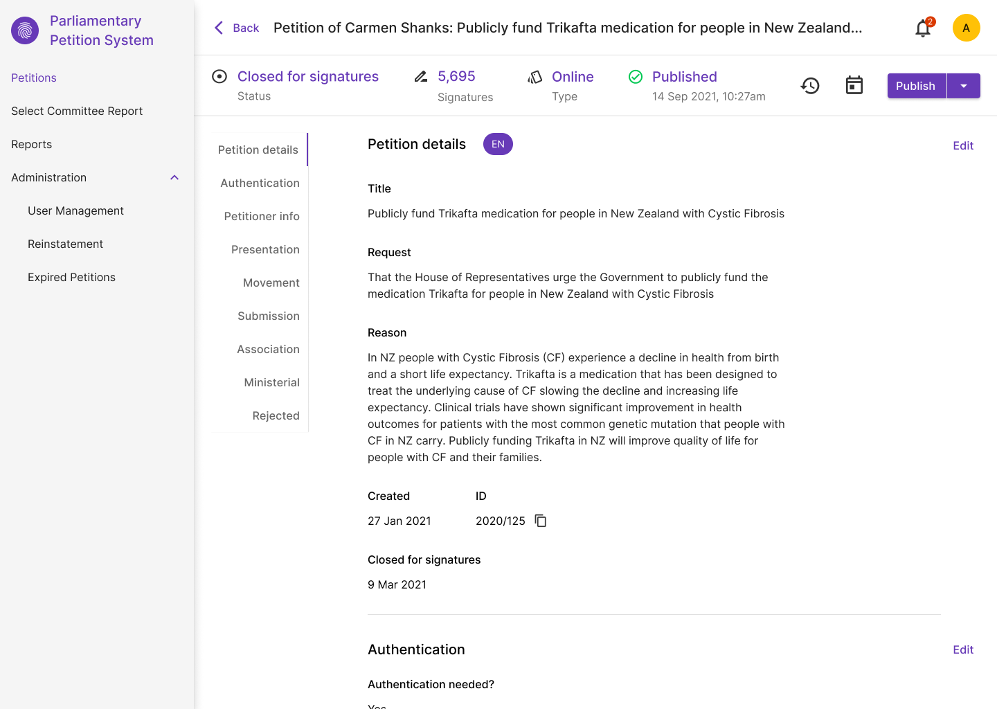
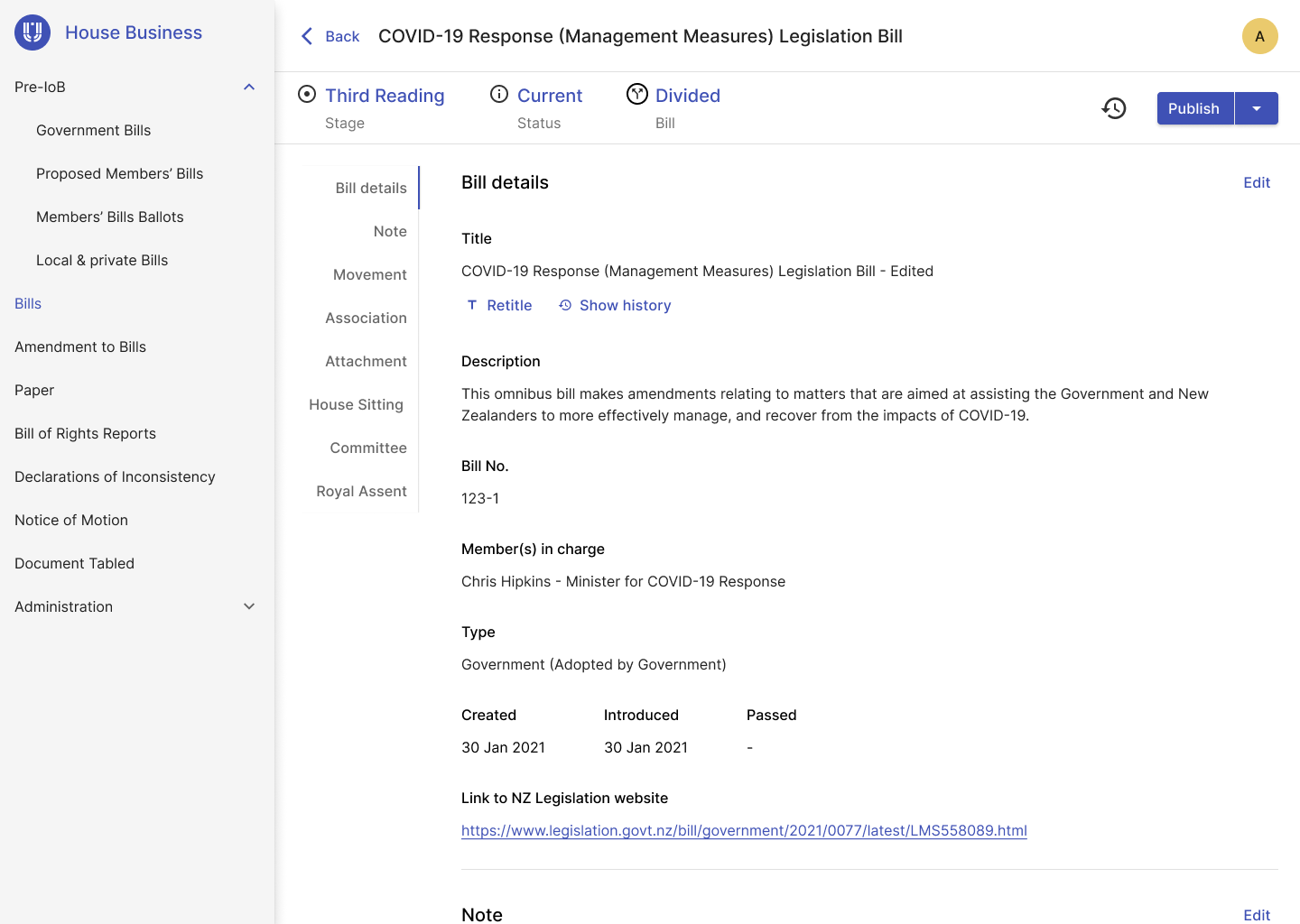
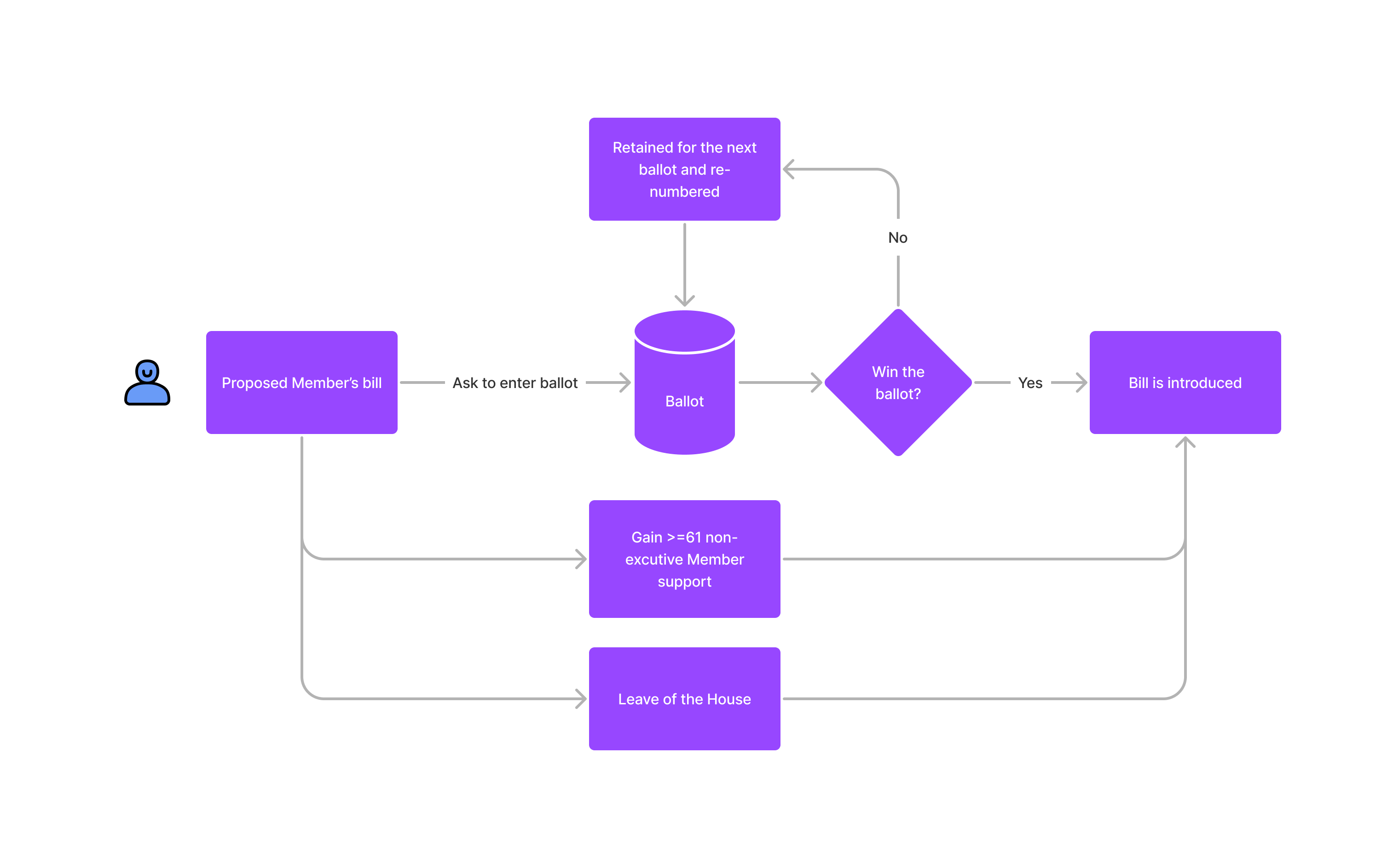
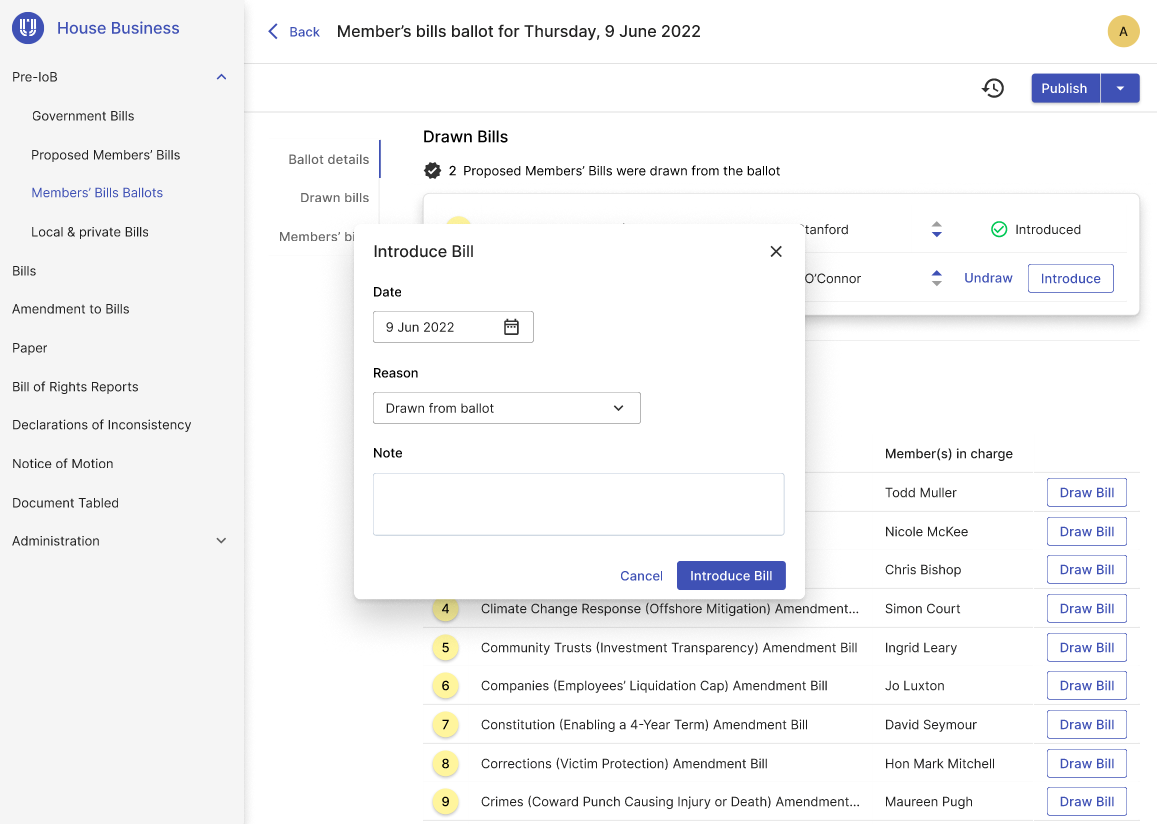
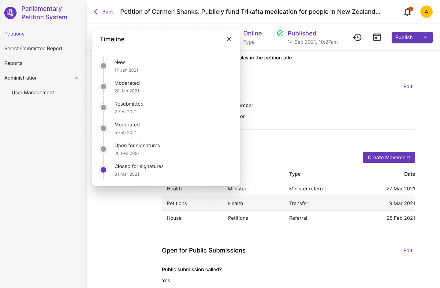
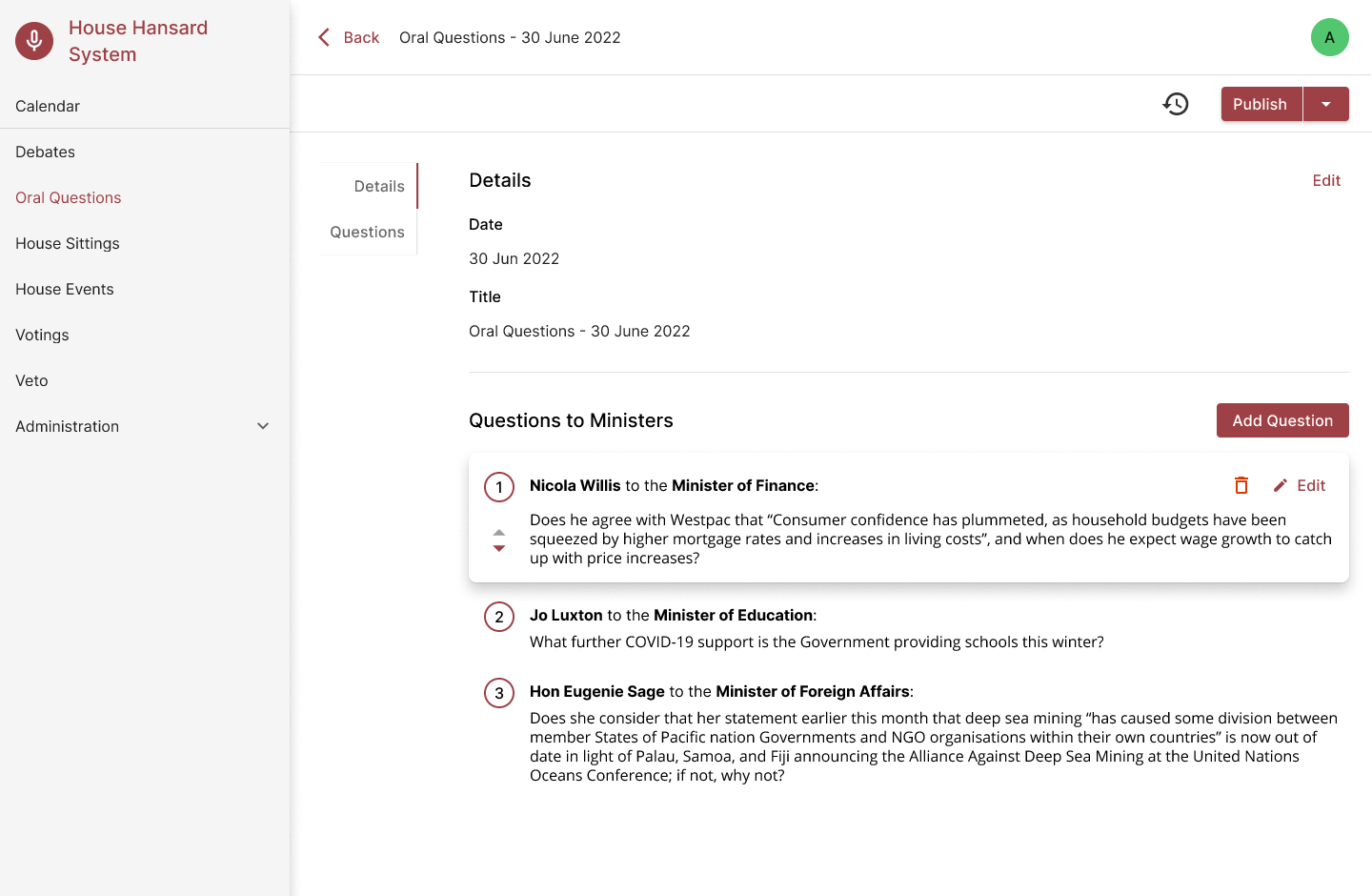
1. When dealing with their day to day task, users refer to Item of Business, such as Bill, Petition, Select Committee Report. There were over 40 Items of Business identified for this project.
2. Each Item of Business needs to have a listing page with search, filters and table
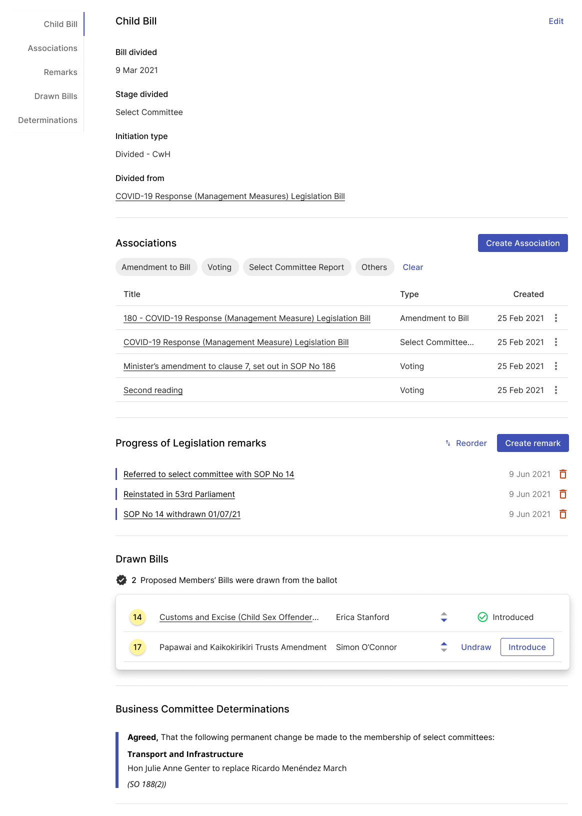
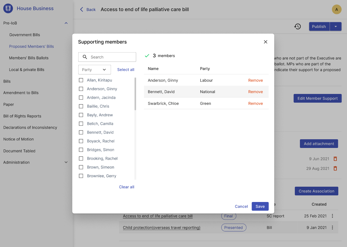
3. Each Item of Business needs to have a details page. Information in the details page can be divided into different sections with some Items of Business share similar sections.
I used Petition System as a pilot project for creating Parliamentary Design System. With multiple design meetings and iterations, design patterns were established and then reused in other applications.
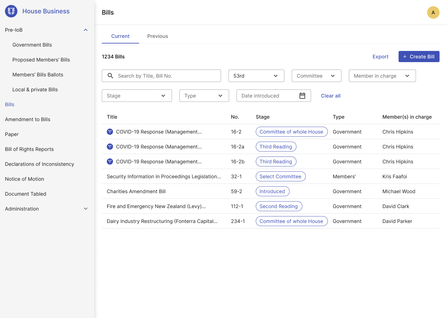
With the design pattern in place which gives all six applications similar look and feel, the next step is to give each application unique characters so that users can easily distinguish them from each other. Different color and icons were used to define application's individual identity. Color was strictly chosen to match WCAG color contrast criteria.
One of the biggest challenges I faced throughout this project was gathering enough requirements and information about parliamentary process to move forward with design. The old system that used to manage parliamentary data was the starting point, but information was so disorganised and out of date. There was limited documentation about how the process was run and what data needs to be recorded internally.
I observed this problem early enough in the project and invested time with Business Analysts to get better idea of requirements. Multiple workshops and meetings were set up to engage users from the Office of the Clerk to truly understand their process and needs. It was quite time consuming to set up all these meetings with different stakeholders, but saved a lot of back-and-forth in the project team "guessing" what users want.
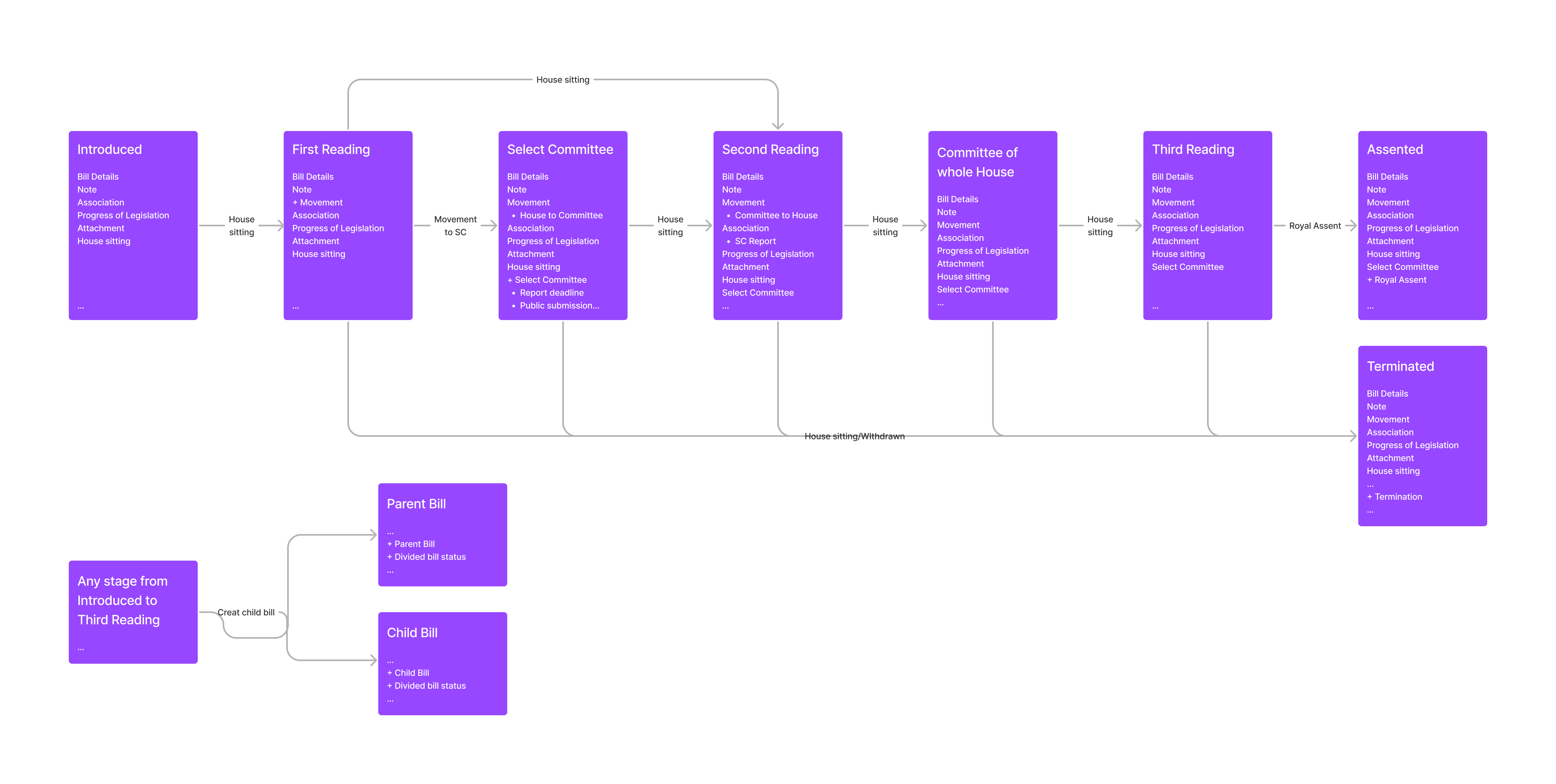
The most significant improvement this project can deliver is to make data keeping more pleasant and efficient. It is users' day-to-day tasks to create, update and publish parliamentary data in the system. To make data management an ease, I made lots of card sorting sessions with users to make sure each data point was grouped into the right category for that Item of Business. I also took a modular approach for grouping data. Each group is a module that can either be reused for other Item of Business or be created as a unique group.
The sheer size of data in each Item of Business means that I need to find a way for users to quickly locate relevant data point they wanted to view or edit. Instead of placing data in separate tabs, I chose the approach to consolidate all the data in one page with carefully named section title as a reference. The details page also comes with a side navigation bar for user to quickly navigate to relevant section.
As the only UX Designer in the team, one of the challenges is to demonstrate the importance of UX Design in the product development lifecycle. The most powerful and effective way to communicate design is through wireframes and prototypes. My process involved sketching and white-boarding concepts and flows with my Business Analyst partner and then translate these into hi-fidelity design. I also use Figma intensively to combine these wireframes into prototypes. Using these tools to communicate with stakeholders, users and developers greatly improved team coordination and proved to be very effect way to gain meaningful feedbacks.
Iterative releases were made for each application ensuring there is enough time for testing and user feedbacks. Most users praised the ease of use compared with legacy system and the fresh modern look. The efficiency and productivity of staffs were significantly improved through the redesign of the apps. The establishment of design system and patterns allows some apps to be built without any detailed design. However, more design resources were needed to ensure the final products were delivered in a human-centered way and more business values were achieved out of the investment.